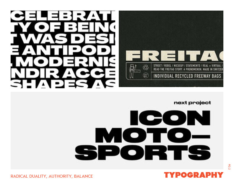
BRAND IDENTITY
Brand identity, responsive logo, brand & website guidelines for a local non-profit providing a radically transformative community to support formerly incarcerated men.

THE BRIEF
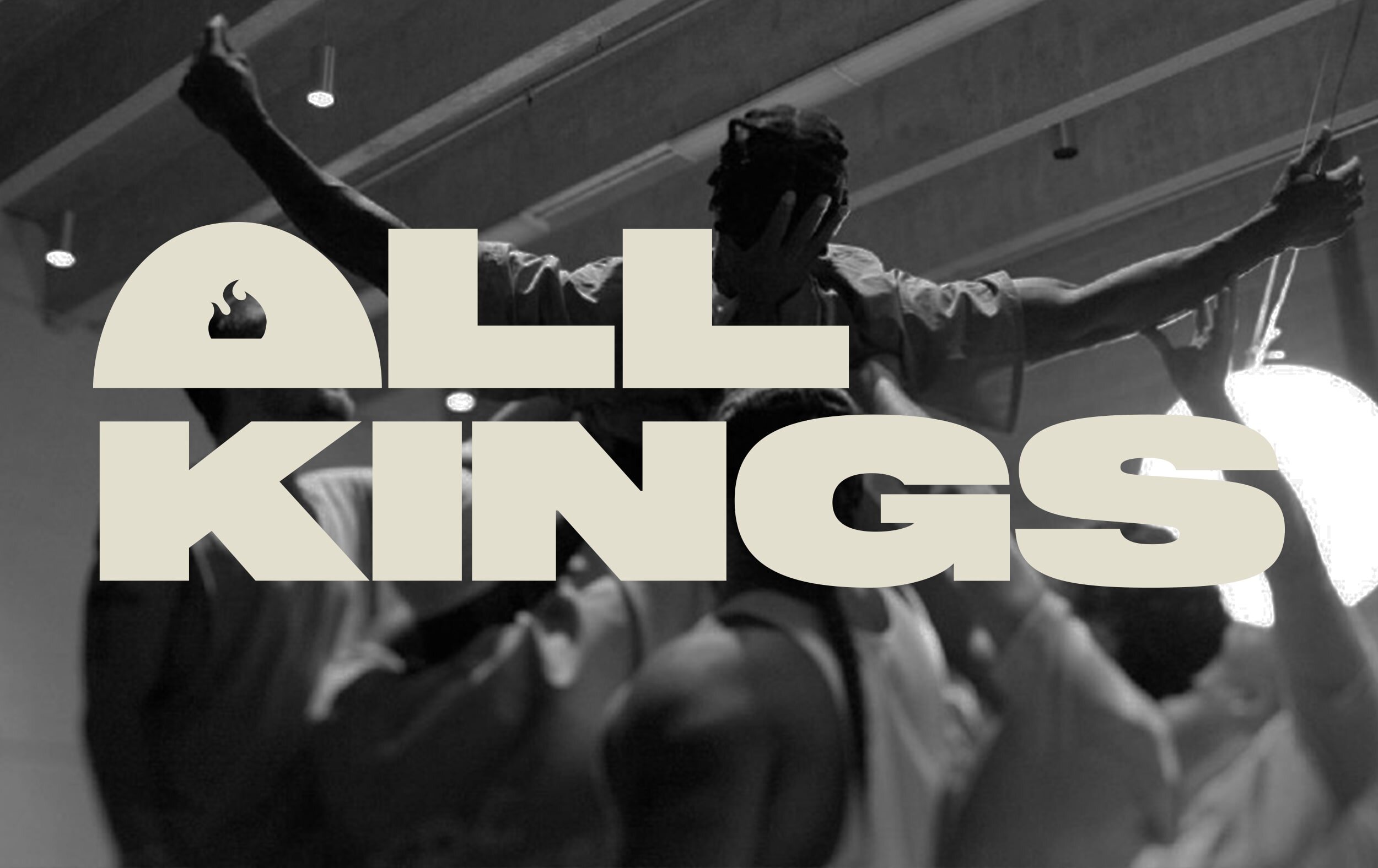
All Kings is a community of men dedicated to justice and freedom. Started with the goal to provide resources and support reentry for formerly incarcerated men, All Kings is creating a multigenerational and inclusive community for all men of diverse ages, ethnicities, orientations, and economic backgrounds to grow and heal together. The shared trust, vulnerability, and inspiration they co-create were astounding to witness, but the magic and heaviness of their work were not effectively conveyed through their introductory touchpoints, namely the website.
THE SOLUTION
As a woman with very little first-hand experience with the systemic oppression of the criminal justice system, once tasked with the responsibility to create All Kings’ brand identity I delved into a frenzy of research. It was imperative to convey not only the weightiness of topics they addressed, but to emphasize the radical joy and the human and spiritual connection they provided through retreats, group circles, and mentorships.
The logo strikes a balance of masculine and feminine nature through the tightly kerned, bold lettering softened by curvatures. The main motif of the flame in the “A” symbolizes a central and literal figure of the flamekeeper that keeps a symbolic fire alive during their healing retreats. This was reflected once more in the muted, dignified color palette that evokes the comforting, grounding, and powerful nature of fire. The responsive logomark was designed to be fluidly interchanged to differentiate between events, groups, and/or future campaigns.